Natural Stone Series: Is Grey The New White?
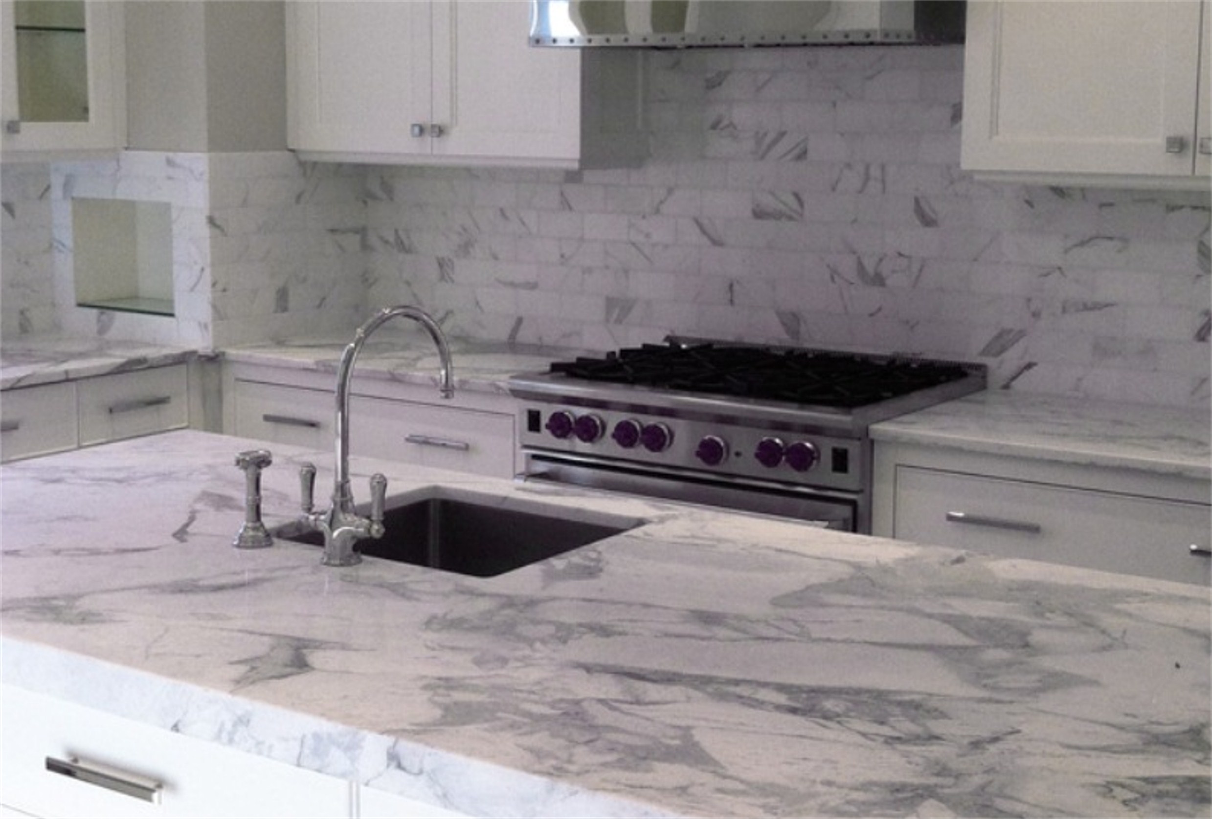
June 06, 2012We previously wrote about the Top 10 reasons to consider white for your next home design project in "White Marble & Granite: When the Absence of Color is the Color of Choice!" White is indeed a designer’s dream when it comes to opening a space, defining architectural elements, and emphasizing the cleanliness of a space. However, it is equally true that designers are continually reimagining style and interpreting it across a spectrum of colors, textures and combinations. No surprise then that there’s another color which joins white as a designer’s top favorite for a contemporary, monochromatic palette – and 10 reasons you should consider grey for your next project:

1. Grey is a canvas. When you choose grey materials (such as travertine, Granite or quartzite) and pair them with grey tones on the walls, cabinets, and floors, it creates a cool, neutral canvas. Like white, grey does not compete for attention with design elements. Unlike white, grey blends more than contrasts with bolder colors. As opposed to a severe color, such as black, grey will not overpower or diminish the effect of bold, accent colors.
2. Grey is sophisticated. Jennifer Lopez recently re-imagined her California home in shades of grey with the help of interior designer Michelle Workman. According to Workman, Jennifer wanted modern and streamlined but to retain sophistication and stylishness: “There are all these tones of gray, and we played with that—using a bit more of a gray-taupe here, a bit more of a gray-blue there. It's almost like a black-and-white film from the forties." (Consider Ostrich Grey quartzite, White Oak marble, or Steel Grey granite with light grey walls and grey-blue furniture accents to achieve Jennifer’s vintage movie look!)
3. Grey creates depth. As grey comes in shades from near white all the way to dark charcoal, it’s easy to use it to create light and shadows. Subtle variation of the same color can add character and take a plain room to a multi-dimensional one, creating recesses and reliefs where there are none. White does this in a bright, airy way, giving the illusion of more space. Grey achieves something similar in a subtle, warm way, altering space by taking a large room to a cozy one. (For example, strategic use of darker grey accents in one area of a large living room will create a nice sitting area.)
4. Grey is versatile. The many faces of grey make it a versatile color. Grey is also unique in that it responds differently to the colors with which you might choose to pair it. It gives depth to subtle colors, like pastels and organics, and enhances bold colors, like jewel tones, by showcasing them against a muted background. Whether with pastels, vibrant colors, or even itself, grey blends evenly. When mixed with other grays, blacks and whites it creates a striking, contemporary look.
5. Grey is subtle. White tiles against a peacock blue wall is a bright, cheerful statement with a crisp contrast; Grey tiles against a peacock blue wall is a warm, more subtle way to provide contrast while still embracing color. Choosing where you want that cheer and where you want that warm look is a subtle art in itself. Perhaps your selections will depend on what room you’re in and what purpose it serves. I.e., you might select shades of white with blue accents in the kitchen or breakfast nook to brighten your morning and shades of grey with blue accents in the bedroom to encourage slumber.
6. Grey is masculine – and feminine. By nature, “neutrals” are fairly gender neutral. A white room can belong to either a man or a woman. The same is true for beige. When it comes to grey, it can be gender neutral, but grey can also seemingly define one gender or the other. A room with light grays, white ceiling and colorful accents can be lovely and distinctly feminine. (A perfect example is our Athens Grey marble.) A room with darker grays, light gray ceiling, and warm wood colors can be decidedly masculine. (Check out our Azul Platino granite.)
7. Grey is “temperamental”. It can read warm, it can read cool. It can even read cold. It can be dark or bright. It can make a room feel light and open or warm and calming. Because grey has so many complexities depending on the blend, designers love it. Best of all, its “temperamental nature” has not typecast it to a particular mood. Designers can use it however they wish to create a new feel. Red is bold and passionate. Yellow is cheery. Green is soothing. What is grey? Whatever you want it to be!
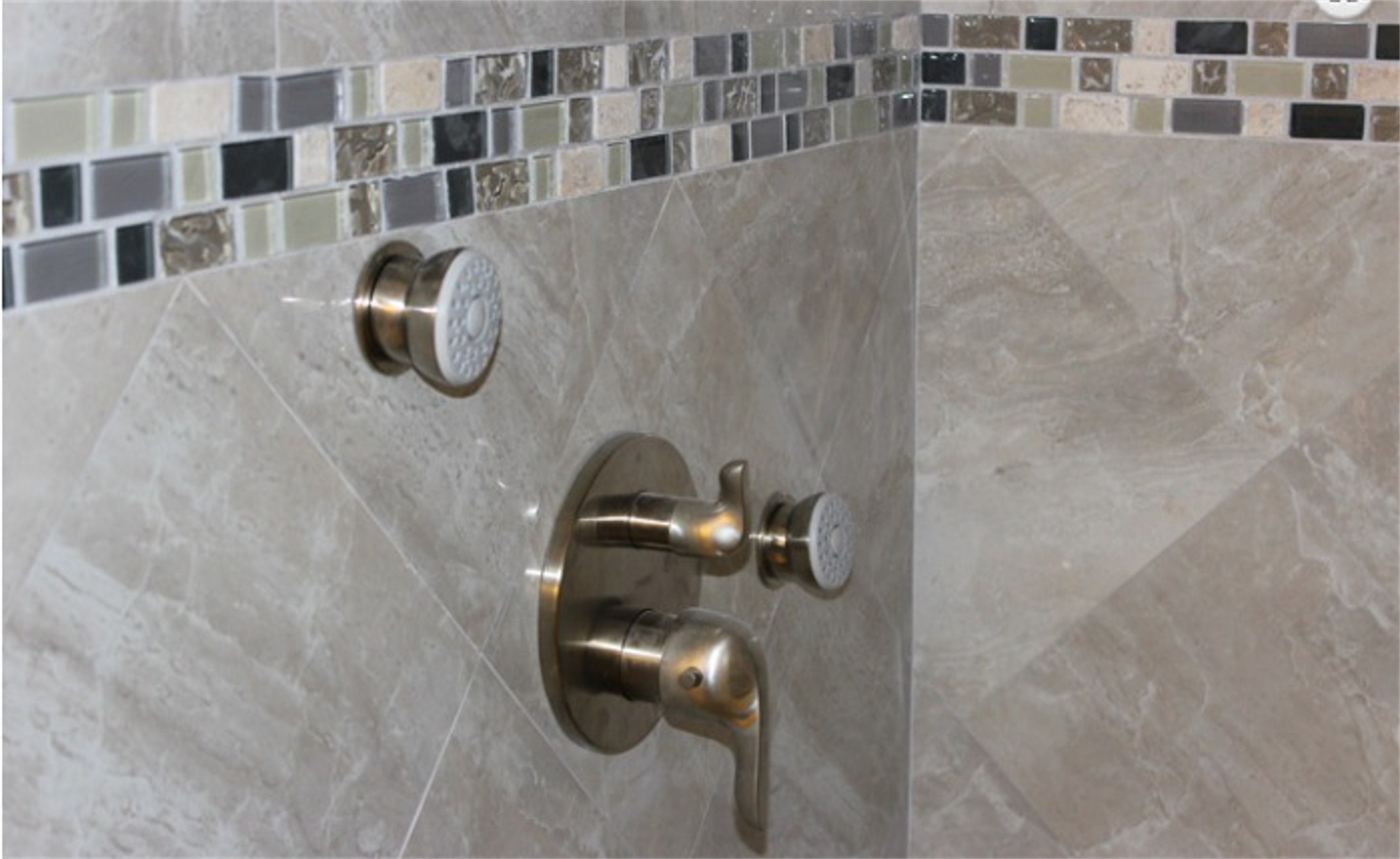
8. Grey is an elegant toner. Grey can make almost any color smokier when blended in. (Like grey-blue, grey-green, or even dusky pinks and browns, like clay-beige.) In addition, it also marbles nicely with other neutrals to create complexity and tone down the harshness of a single color on its own. Check out grey color blends like Virginia Spring (slate), Onyx(porcelain), or Silver Travertine (travertine) that each serve as perfect, elegant accents for your grey on grey themed space.
9. Grey doesn’t absorb. We previously wrote about how white can actually absorb and reflect colors around it. (Remember how a red vase against a white wall can create a pink halo?) Designers love this effect because they can add interesting color to a space without having to commit to it. Grey’s effect is just the opposite, though equally appealing. It doesn’t absorb. This means designers can control the room and not worry that a red vase is going to change the mood they’ve worked so hard to create. Two different results – similarly beneficial depending on your goal!
10. Grey is formal. We’ve mentioned that grey is sophisticated and elegant. It is also a traditionally formal, conservative color. This may be why we often see grey as a popular choice for uniforms (as well as for suits and wedding tuxedos), representing balance, steadfastness, and dependability. While grey can also be whimsical when offset with vivid colors, grey’s cool elegance when coupled with silver and wood is the perfect marriage for your formal rooms.

They might be on opposite ends of the neutral spectrum, but white and grey each advantages and can both reign supreme as designer favorites for different reasons. Whatever area you are looking to update and whatever material you choose to use, be it grey granite countertops or grey travertine floors, consider how an all grey color scheme fits your decor.
Grey isn’t the new white. It joins white as a designer’s favorite when it comes to painting you as subtle, modern and sophisticated.

